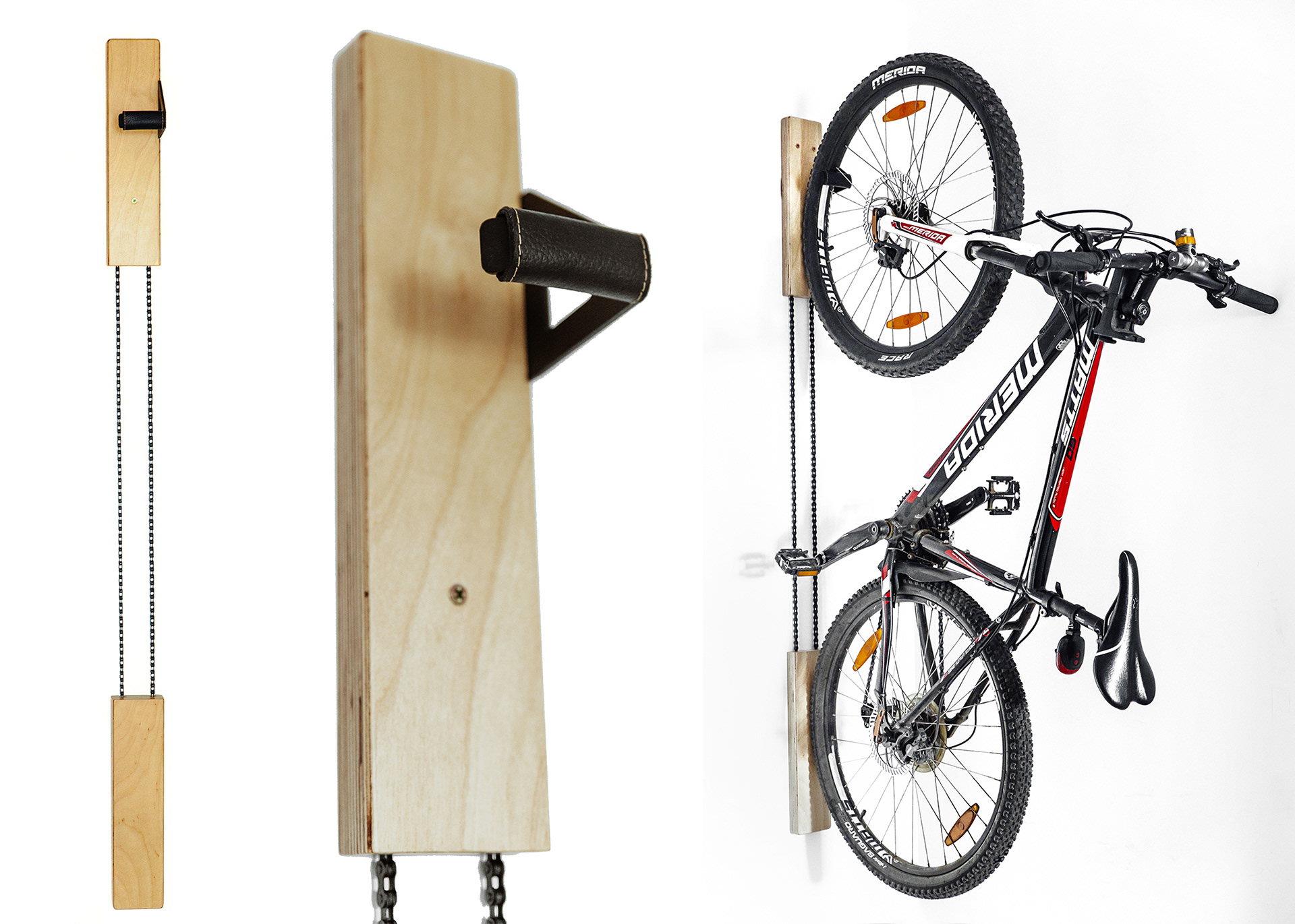
This is a project I've done for a client as a freelance graphic designer. Wokana is a company that handcrafts minimal bicycle racks designed for apartments and small places. They are a startup and this was their first logo ever and they didn't have any concrete idea about the direction and so I had full creative freedom.
As a designer I'm usually faced with a starting problem for which I'm trying to provide a solution through design. In this case I didn't have that starting problem, or a specific direction from the client, and that can be a nice thing from a creative standpoint but in the same time can make things very difficult without any guide lines.
To make the design process easier, faster and therefore more affordable I decided to implement some basic aspects of UX Design research. I asked them as many questions as possible to find out the core aspects, principles, philosophy and aims of their company. After finding the answers to my questions I had some design directions. And after showing them examples of previous works I've done for other clients, we agreed to go with a minimal design that can match the minimal design of their product.

I always start brainstorming ideas by free-drawing with a pencil on paper and in this case I started from their brand name. I tried both lower case and upper case letters and also I played around with the simplified shape of their product. At one point while trying to incorporate bicycle wheels into the logo, starting with the obvious "o" and then I realized that if I use a specific, rounded style of lower case "a" I could incorporate a wheel symbol into the "a"-s as well thus being able to have two wheels in the logo and maybe add a bike frame above them to make a bicycle in the logo. But while thinking about that I realized that if I break the logo and aligned the lower case "a" one under the other it actually resembles their product in use with bike wheels attached to it.

Then I started to iterate this idea in Adobe Illustrator. This process helps me always to visualize both the problem and possible solutions and also to improve on the solutions by adding or removing small design elements.
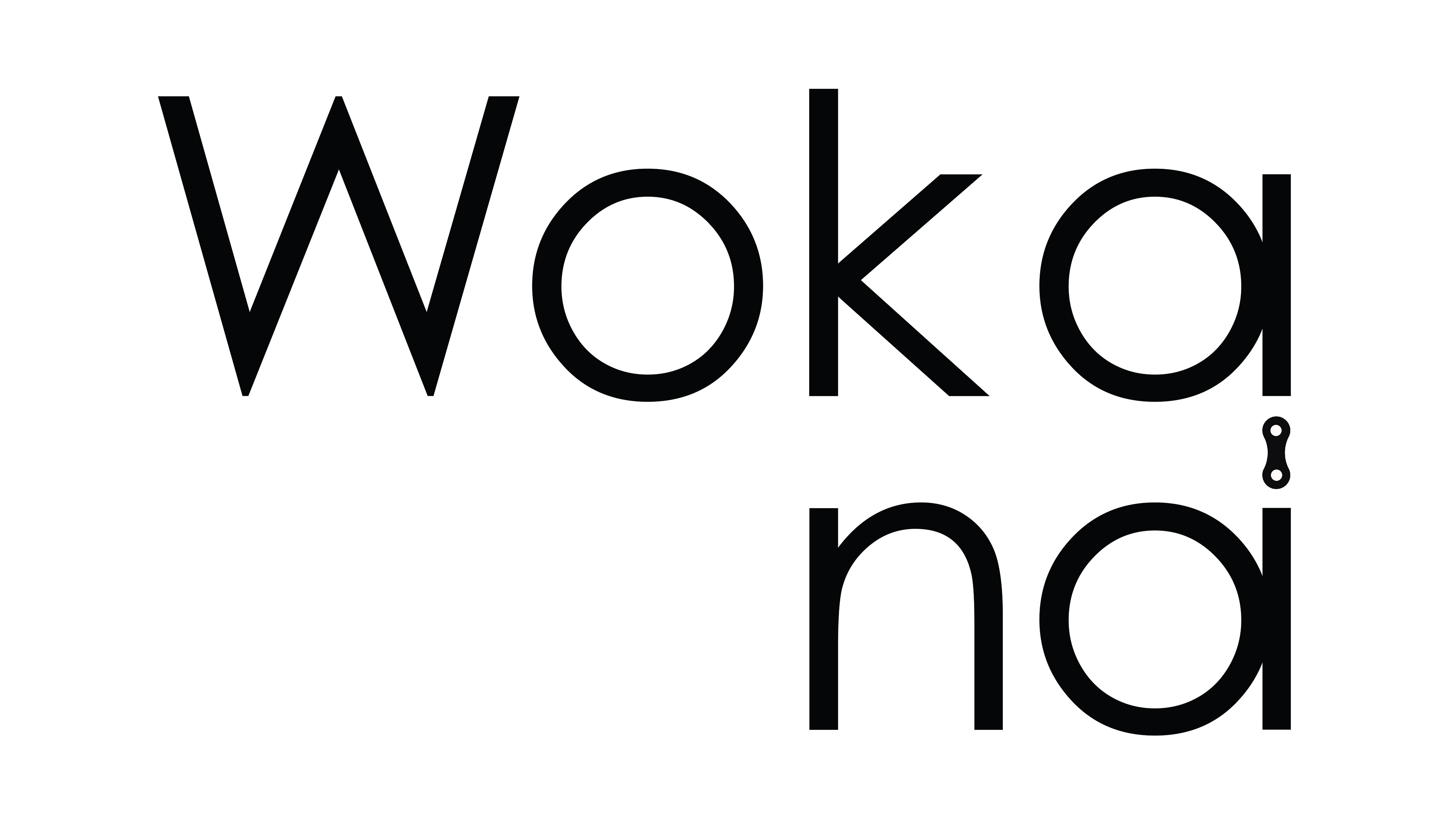
To simplify the design I started to remove unnecessary elements, like the spokes from the "wheels" and to simplify some other elements like the "W". And after a few more iterations I got the idea of making the design a bit more stylized by removing the two parallel vertical lines between the "a"s and replace them with a bike chain link.
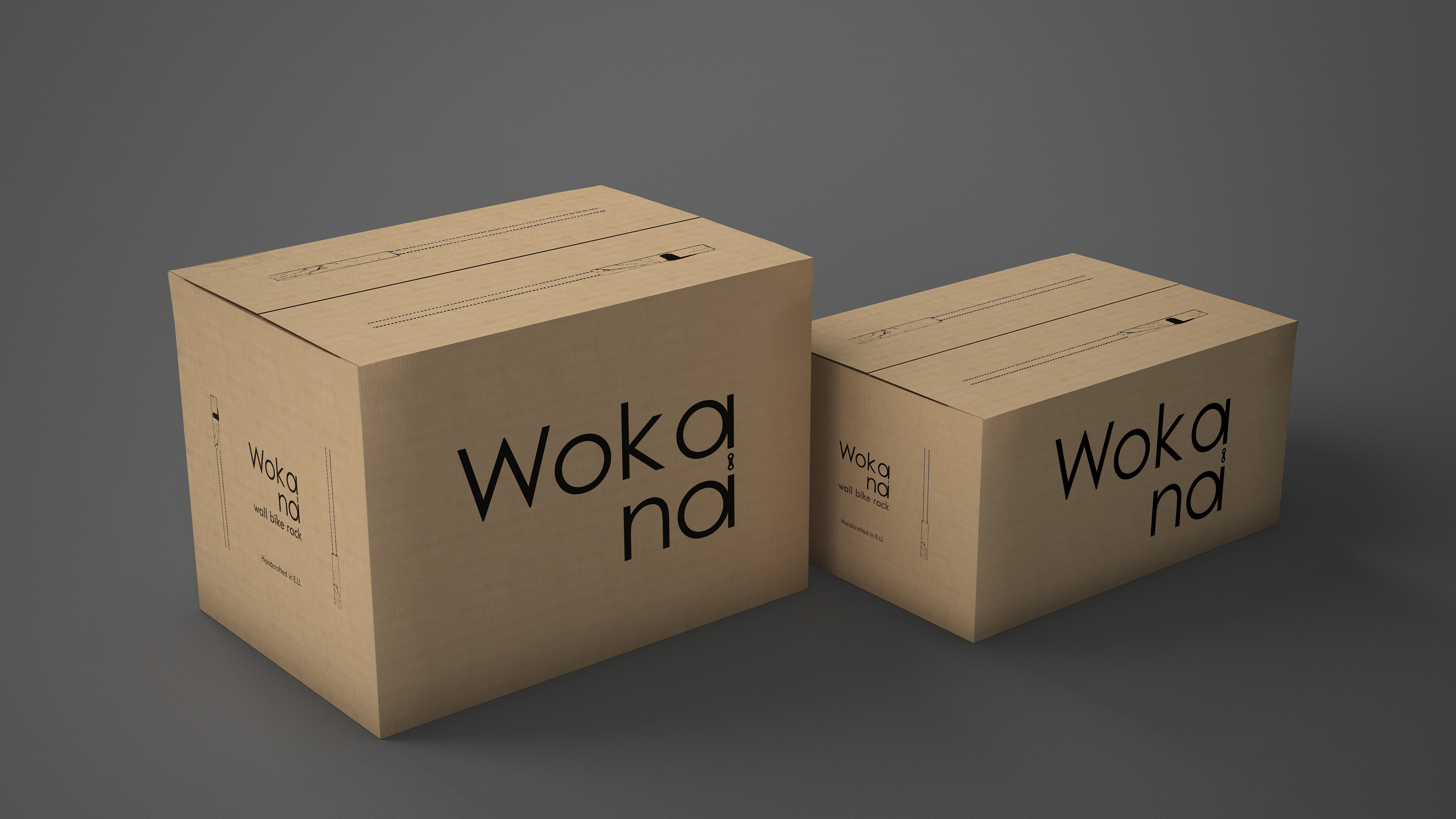
After I had a satisfactory logo design I made a few mockups in Adobe Photoshop and I also included some package design elements.