PPC Anchor
PPC Anchor is a company that creates and manages Google Ads campaigns and they had a concrete idea about the logo design. There was no need from my part to implement any UX research, they knew exactly what they wanted, from the main graphic elements to the exact color shade and everything in between.
As a designer I'm usually faced with a starting problem for which I'm trying to provide a solution through design. In this case I didn't have that starting problem, but I had a specific direction from the client, and that is something that I particularly like, having guide lines.
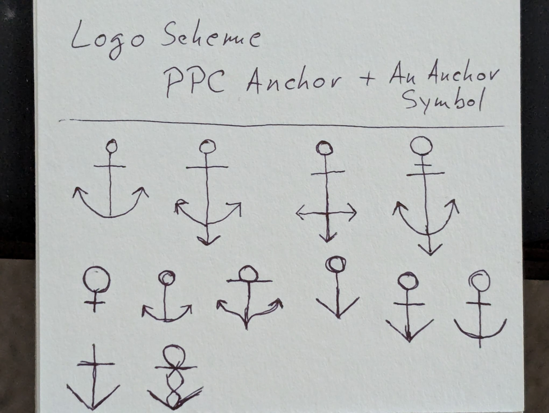
To make the design process easier, faster and therefore more affordable I always start brainstorming ideas by free-drawing with a pencil on paper.
The client wanted their logo to be composed of an anchor symbol and their company name written in upper case letters for the first part and lower case the second part. So I started by iterating some fast sketches of anchor shapes.
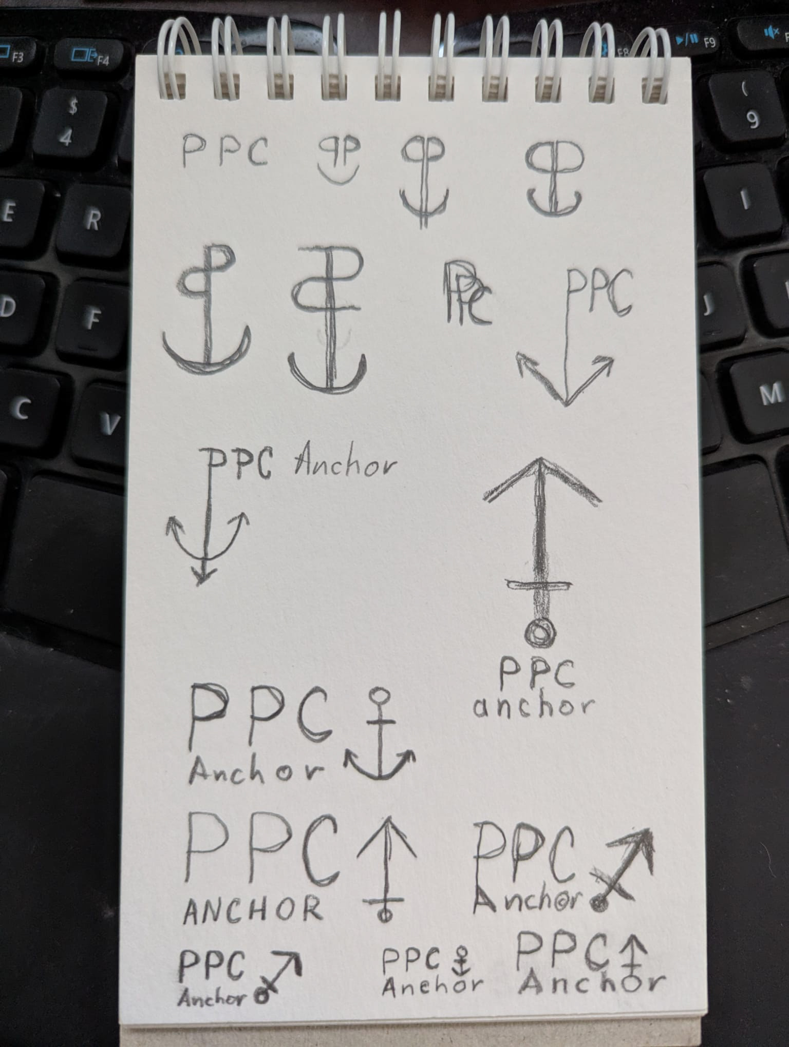
The second part of fast sketching on paper was to iterate different fonts and different combinations between the actual logo and the anchor shape.
Next step was to present these sketches to the client and they chose one specific design to develop further.
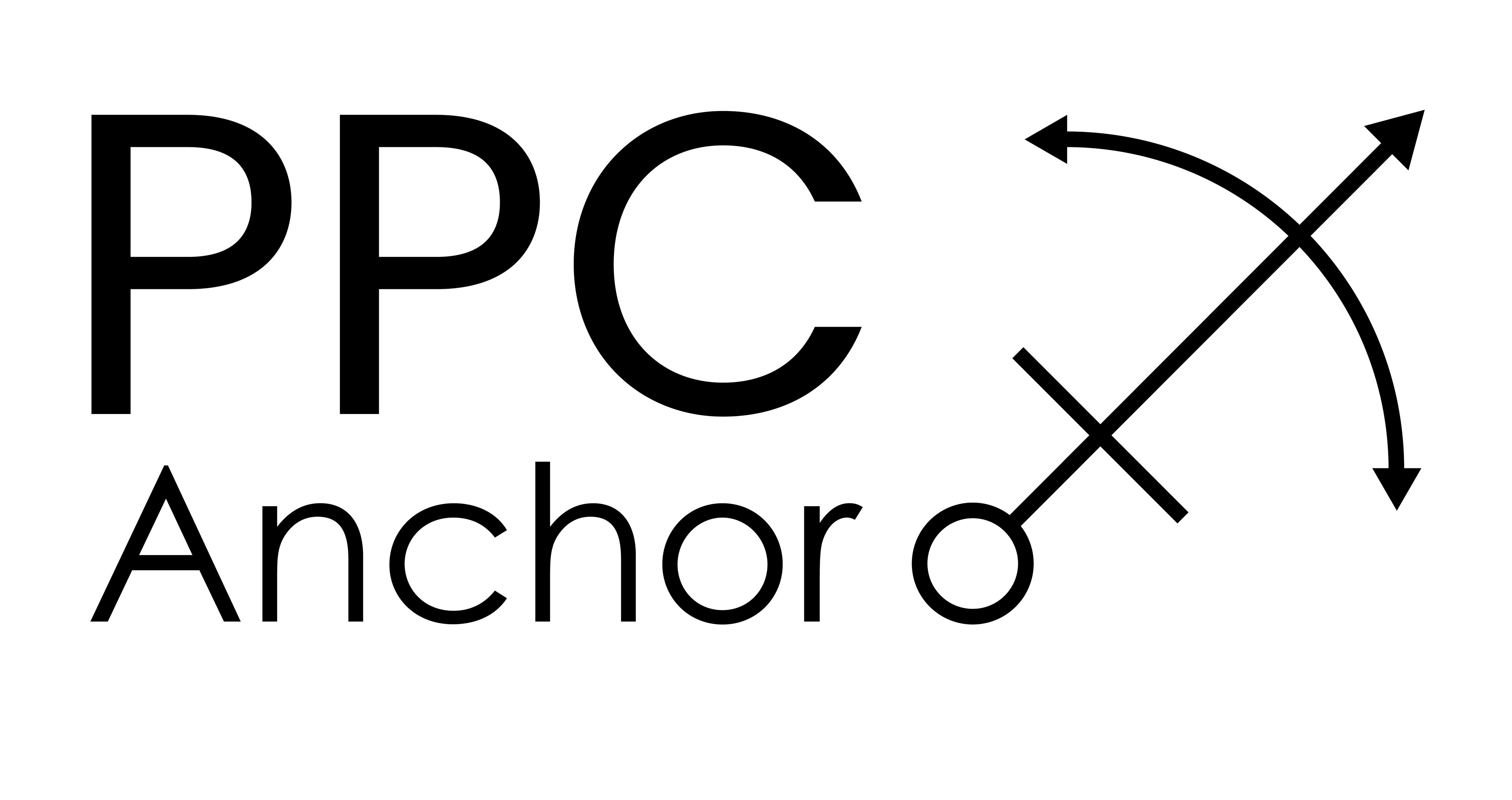
This was the design they picked which I iterated in Adobe Illustrator.
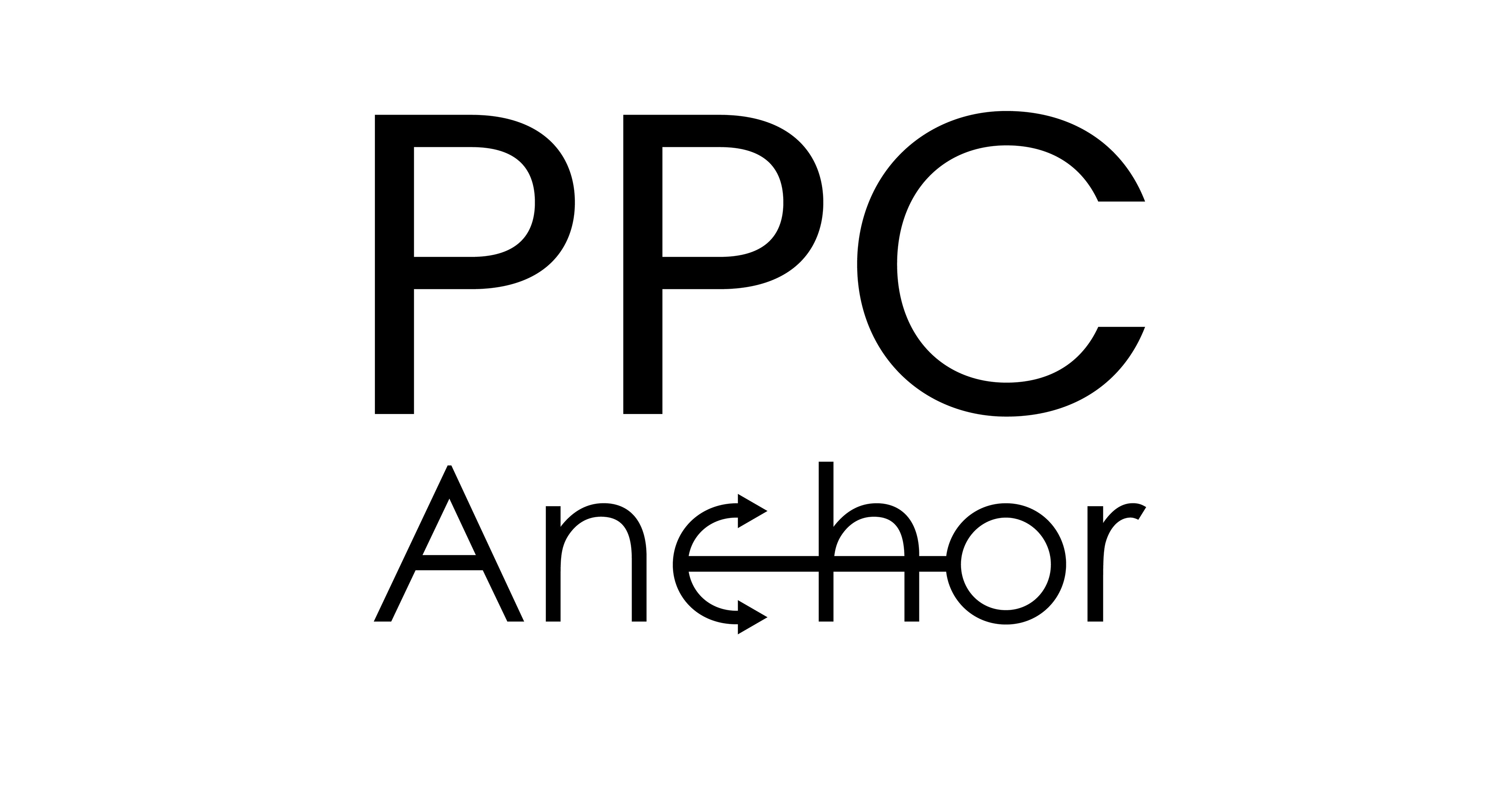
While working in Illustrator on the previous design I had this new idea which I showed to the client and they immediately loved it and wanted to develop it further with the only change being to change the color with the one they provided.
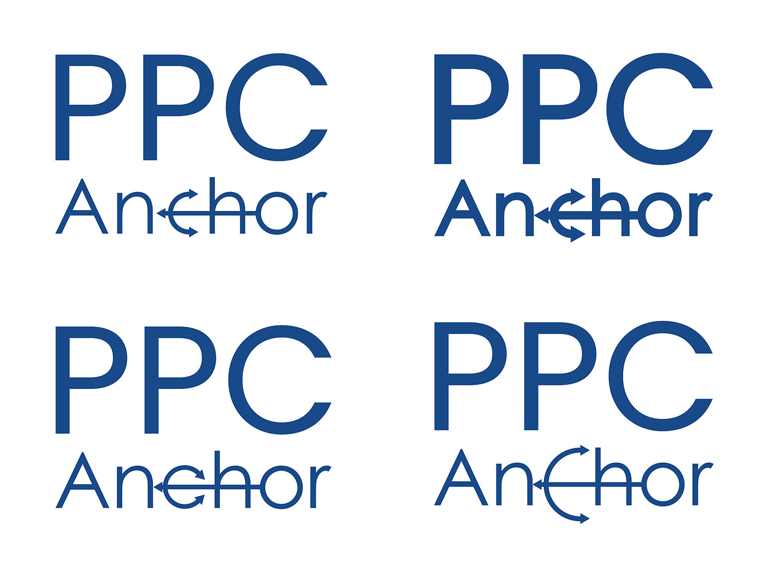
Here are four different slight versions of that last idea that I showed to the client next and they wanted something in between the two top versions and the anchor shape with a different color so that pops out.
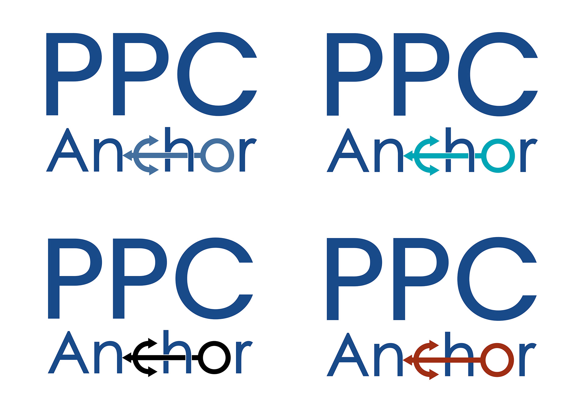
These are the versions with a colored anchor shape. With the first one I went for a more subtle color, the second one uses an analogous color combination, the third is combined with simple black and the fourth one is combined with the other main color that the client uses on their website.
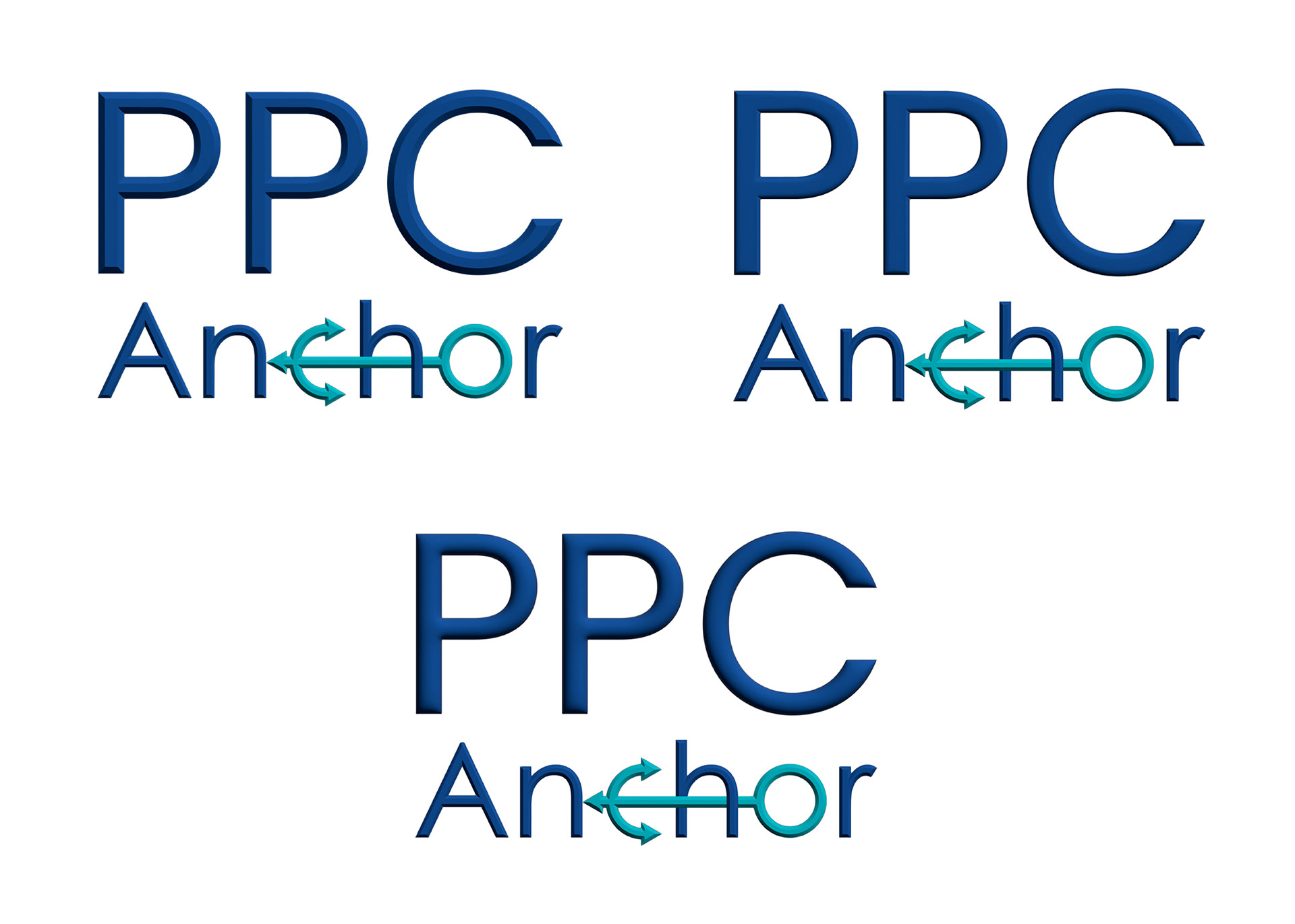
I also offered them two different ways of interposing the anchor shape with the anchor word, one with the shape on top of the word and the others with them intercalated.
The client chose the second one, the one with turquoise anchor.
I also offered them some 3D options but they preferred the flat design.
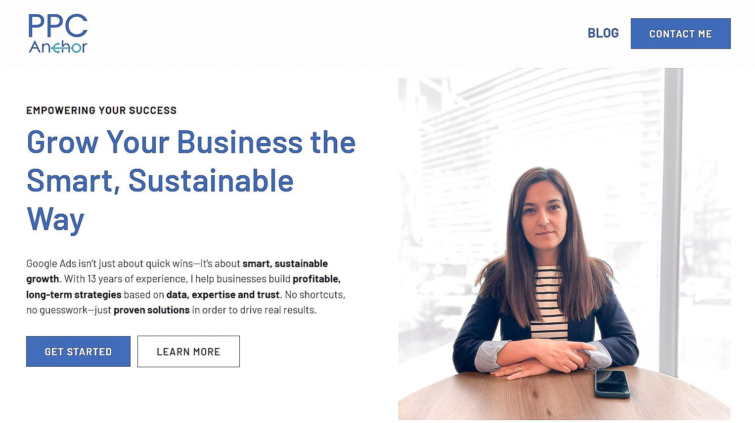
This is a print screen of the client's website home page.