PERSONAL ASSISTANT APP
How it started
This mobile app started as a college capstone project that evolved into a startup effort in development with an experienced software engineer for Adobe.
UX Research
Problem Statement
Many people struggle to be on time for meetings and appointments because they are very busy and overwhelmed on both professional and personal levels.
Target Audience
Busy, young working professionals who are struggling with time management. They get absorbed by what they are doing and forget about time, or think they will have enough time for all their needs and forget about small details that can add up.
Product Concept
A mobile app that helps users manage their time better by giving them reminders and helping them schedule all their activities including routines.
Competitive Analysis
Competitive analysis has been done in order to identify major competitors, research their products and identify potential opportunities where we can outperform them.
Interviews
User interviews were conducted in order to get a better understanding of the problem: why people are late and what would they need to manage their time better.
Approach: Interview
Method: Face to face
Number of Participants: 10
Locations: Bellevue, WA; Seattle, WA;
Interview Participants Insights
1. Routines are created around regular activities.
Participants in the study have a specific order in doing their regular activities and each activity takes approx. the same amount of time every time they do it.
2. Scheduling and reminders help being on time.
Participants in the study would like to have reminders on their phones for scheduled activities and even for routines.
3. Time for small unexpected events tends to get forgotten.
Participants in the study tend not to take in account small unexpected events like traffic, looking for parking, locking the door, feeding the pets etc. before leaving the house.
Card Sorting
The main features of the mobile app were decided by using an open, face to face card sorting session with actual post-it notes.
The participants organized the topics into categories that made sense to them and an impartial observer was present and labeled these categories.
Card sorting was used because it's quick to execute, involves users and it helps create the information architecture that suits the expectations of users.
Personas & Scenario
Personas
Three personas were set up based on the above interviews by answering the questions "who would use our app and why?" and "what behaviors, assumptions, and expectations do they have?"
The purpose was to look for themes and characteristics that are specific, relevant, but universal to the target users. These include behavior patterns, goals, skills and background information, as well as the environment in which the persona operates.
Primary Persona - Emma's Story
▪ She works as a software engineer for a big company and has an upper-middle income level.
▪ Emma likes reading, watching movies, playing board games with friends and she tries to hike or bike every weekend.
▪ In weekdays she has the same daily routine which includes waking up around 6:30 AM, having some breakfast, walking her dogs and then getting ready for going to work.
▪ She has a daily team meeting at 11:00 AM and a weekly therapy appointment every Thursday at 8 AM.
▪ In the evening she does chores or runs errands and spends time with her husband and their dogs. She likes to read in bed before falling asleep.
▪ In weekends she doesn't have a specific routine but she would like to wake up early enough to go in a hike with her husband and their dogs.
Scenario
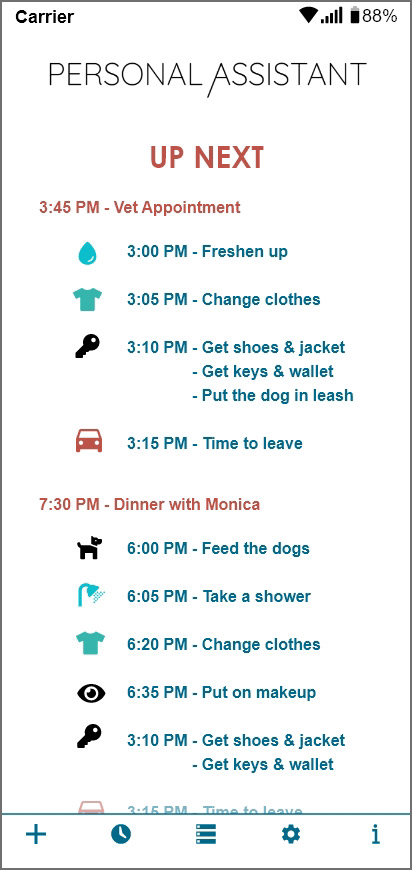
Emma Miller has problems with time management. She wants reminders and scheduling that she can customize around her personal needs. Emma uses the app to customize and set up a reminder for her upcoming appointment. Emma receives a reminder on her phone at the selected time and she starts to get ready on time.
Architecture
The architecture of this app focuses on the organization of information to make sure that the users can easily find what they need. Also focuses on a flow that lets users navigate between screens without much effort.
Sketches & Wireframes
Sketches
The design process started with sketches on paper in order to try out faster more ideas before the final one was chosen.
Sketches helped planing how to tackle the problem. They allowed the team to see how ideas begin, evolve, and crystallize into the solution.
Lo-Fi Wireframes
The low fidelity wireframes include the most basic content and visuals and are static (not interactive).
They were used to visualize and test early concepts, requirements and design assumptions at the beginning of the design project.
These wireframes helped to map out the shell of the interface, its screens and basic information architecture.
They are devoid of color, icons or font choices, logos, or any real design elements that take away from focusing on content, navigation, and structure.
Hi-Fi Wireframes
The high fidelity wireframes are a more complete representations of the end product. They help to communicate how aesthetic features support essential functionalities.
Their aesthetics and content are more precise and focused on refining the graphics, spacing, and layout.
UI Design
The goal for the UI design was to produce user-friendly interfaces that are more intuitive, enticing and forgiving. It was based on the following design principles:
1. Place users in control of the interface
All the actions were made reversible so the users will be able to quickly backtrack whatever they are doing. This would allow users to explore the app without the fear of failure — when a user knows that errors can be easily undone, this encourages exploration of unfamiliar options.
For the users to feel in their comfort zone they are given context of where they are, where they’ve been, and where they can go next by providing visual cues and predictable actions.
2. Make it comfortable for a user to interact with a product
The interfaces were simplified by removing unnecessary elements or content that does not directly support user tasks so that all information presented on the screen will be valuable and relevant.
3. Make user interfaces consistent
The visual consistency (the same colors, fonts, and icons) and functional consistency (behavior) are present throughout the product.
The behavior of interface controls, such as buttons and menu items, do not change within the app. Which means the objects work in the same way throughout the interface and so the interface behave the way users expect it to behave.
The app is consistent with user expectations by following platform conventions, by using solution patterns for most design problems and by using the same terminology.


Design Brief
